Quantcast
Channel: The Design Files | Australia's most popular design blog.Mavericks Laces - The Design Files | Australia's most popular design blog.
Viewing all 2499 articles
Browse latest View live

A Sleek, Shed-Style Home In Rural Victoria

$
0
0

A Sleek, Shed-Style Home In Rural Victoria

Architecture

by Amelia Barnes

The Springhill House by Lovell Burton Architecture. Photo – Ben Hosking

The flat metal sheet on the facade was selected for its reflective qualities and durability. Photo – Ben Hosking

The prominent yet refined slanted roof collects drinking water and solar energy.  Photo – Ben Hosking

A large sliding door opens the kitchen and dining space to the outdoors. Photo – Ben Hosking

The semi sheltered outdoor area. Photo – Ben Hosking

Another seating deck. Photo – Ben Hosking

The home is zoned in two parts with working spaces located to the south, and a large living space to the north. Photo – Ben Hosking

Birch plywood on the internal walls provide warmth. Photo – Ben Hosking

Views are provided from almost every spot in the home. Photo – Ben Hosking

The living space is flexible and adaptable, with a large curtain in place to divide the space to create a second bedroom or yoga space as required.  Photo – Ben Hosking

At 120 square metres, is more than 60 square metres smaller than the average Australian home. Photo – Ben Hosking

A simple but beautiful bathroom. Photo – Ben Hosking

The combination of beauty and utility is perhaps the defining feature of Springhill House. Photo – Ben Hosking

The home was deliberately designed as a continuation of the paddock, with no discernible barriers between the two. Photo – Ben Hosking

Functionality is at the forefront of this house in Spring Hill – a town north west of Melbourne in the Macedon Ranges.

Lovell Burton Architecture were tasked with designing a relatively modest home on this previously unused paddock, to connect the owners to the land. This desire was born from one client’s childhood spent in western Queensland, which offered a lifestyle they yearned to return to. ‘In many respects, the purchase of the property was part of a reconnection with the land, having lived in Melbourne for many years,’ says Joseph Lovell, principal at Lovell Burton.

While most homes on rural properties are surrounded by a defining fence or garden, this house was deliberately designed as a continuation of the paddock, with no discernible barriers between the two. Acting instead as a place maker is the house’s prominent slanted roof, that also collects drinking water and solar energy. This combination of beauty and utility is perhaps the defining feature of Springhill House. ‘This idea of a functional aesthetic informed many of the design decisions for the project, with the removal of ornament helping to create a very calming space,’ says Stephanie Burton, principal at Lovell Burton.

The aesthetic of the home was inspired by the rural vernacular, with the client often referring to the project as the ‘hay shed.’ This look was also driven by the project’s restricted budget, which Joseph says proved to be a positive constraint on the design. ‘It made the clients and ourselves think critically about the idea of home, and which spaces could be adapted to fit several purposes.’

The home is zoned in two parts with working spaces located to the south, and a large living space to the north. This living space is flexible and adaptable, with a large dividing curtain in place to create a second bedroom or yoga space as required.  A large sliding door opens the kitchen and dining space to the outdoors overlooking a basalt outcrop, and there’s a separate west deck.

Materials were chosen mainly for their durability, but these offer their own aesthetic qualities. The flat metal sheet on the facade for example was chosen for its reflective nature. ‘We wanted the building façade to reflect the hues of the grass in different seasons and the fluctuations of the sky, making the building part of the broader landscape,’ says Joseph. Birch plywood on the internal walls offers warmth, contrasted with burnished concrete floors that provide thermal mass. ‘We are particularly pleased at how peaceful and still the home is to be in,’ says Stephanie.


A 1940s Darling Point Home With Elegant New Interiors

$
0
0

A 1940s Darling Point Home With Elegant New Interiors

Interiors

by Amelia Barnes

Darling Point house by Alexander &CO. Photo – Tom Ferguson. Styling ­– Claire Delmar.

The 1940s home was located in a  heritage conservation area, but had become very worn out over the years. Photo – Tom Ferguson. Styling ­– Claire Delmar.

The 1940s was completely gutted in the renovation to introduce new interiors. Photo – Tom Ferguson. Styling ­– Claire Delmar.

‘Our intention was to couple traditional detailing with contemporary, and bring back into the home some sense of storytelling within each room,’ says Jeremy Bull. Photo – Tom Ferguson. Styling ­– Claire Delmar.

Although all the original detailing of the home was physically lost, this still played a major role in establishing the new interior’s character. Photo – Tom Ferguson. Styling ­– Claire Delmar.

Even though the interiors in this home are entirely new, they still offer a clear view of the property’s historic origins. Photo – Tom Ferguson. Styling ­– Claire Delmar.

Elegant styling details. Photo – Tom Ferguson. Styling ­– Claire Delmar.

The completed project balances elegance with amenity for a couple and their three young children. Photo – Tom Ferguson. Styling ­– Claire Delmar.

Construction on this project was by Fairweather Constructions. Photo – Tom Ferguson. Styling ­– Claire Delmar.

‘We rebuilt the house from the ground up within these walls, including all new internal walls and roof,’ says Jeremy Bull, principal at Alexander &CO, of this impressive renovation project at Darling Point.

Although all the original detailing of the home had been physically lost over the years, the home’s 1940s heritage played a major role in establishing the character of this renovation. In fact, the intention for this project was to recreate a traditional ‘grand home’, complete with a cooking quarters, ballroom and sunrooms.

‘Our intention was to couple traditional detailing with contemporary, and bring back into the home some sense of storytelling within each room,’ says Jeremy. The various details, materials and nostalgic references throughout the interiors capture this feeling, while still embodying a sense of contemporary Sydney life.

Even though the interiors in this home are entirely new, they manage to offer a clear view of the property’s historic origins, without feeling antiquated. Jeremy says, ‘It is quite timeless in this sense. The combination of materiality and shadow is very elegant.’

The completed project perfectly balances elegance with amenity, to serve as a long term home for a couple and their three young children.

An Iconic New Collaboration – Art-Inspired Ceramics From Robert Gordon x David Bromley

$
0
0

An Iconic New Collaboration – Art-Inspired Ceramics From Robert Gordon x David Bromley

Shopping

by Sally Tabart

Photo – Jarrod Barnes.

Photo – Jarrod Barnes.

Photo – Jarrod Barnes.

Photo – Jarrod Barnes.

Photo – Jarrod Barnes.

Photo – Jarrod Barnes.

Photo – Jarrod Barnes.

Australia’s largest production pottery, Robert Gordon, has teamed up with artist David Bromley on a new range of stoneware ceramic pieces. Robert Gordon x Bromley&Co pays homage to the history of both the Melbourne-based pottery, and the celebrated artist, bringing together two creative Australian greats!

This isn’t the first time the Gordon family have worked with the renowned Australian artist. ‘Hanging in the pottery is a beautiful painting David did of our father and grandfather surrounded by pots, painted around five years ago’, says Sam Gordon, one of the four Gordons in the family business. The pottery has made objects and dinnerware for David and Yuge over the years, and have always toyed with the idea of a bigger project – this collaboration was a long time coming!

David, Yuge and Michael Kalnins (Myer’s tabletop buyer, who is also a potter and got behind this collaboration from the get-go) were engaged in every step of the process of bringing this collection to life. Prototypes of each shape were selected from the Robert Gordon pottery in Pakenham, and following this, the design team then took to the process of wrapping Bromley’s artwork onto each piece.

For the Gordon family, this collaboration represents a real milestone. Working on this bespoke collection, with the support of a major department store, is a big deal. ‘I love the nostalgia of a grand department store where point of sale, displays and service are really well considered and thoughtful’, Sam says.

The Robert Gordon x Bromley&Co collection, which launches tomorrow, will have a major display in the front windows of Myer in George St, Sydney, as well as Bourke St, Melbourne, and in Brisbane. To celebrate the launch, Robert Gordon and David will become part of the window displays themselves – painting and making pots live in the Myer Bourke Street Windows on January 27th from 9am-11am and Saturday February 1st from 11am-2pm!

Robert Gordon x Bromley&Co will be available at Myer stores from January 27th. See Robert Gordon and David Bromley painting and making pots in the Myer Bourke Street Windows on January 27th from 9am-11am and Saturday February 1st from 11am-2pm.

How To Do ‘Country Style’ With A Contemporary Edge

$
0
0

How To Do ‘Country Style’ With A Contemporary Edge

Interiors

Lauren Li

The incredible country kitchen at Wombat Barn in Daylesford. Photo – Eve Wilson. Styling – Annie Portelli.

The ‘country’ look is familiar, warm and above all, it’s comfortable. After all, regional and rural homes are often spaces that invite us to slow down, embrace a change of pace, and reconnect with what’s really important.

But country style needn’t be old fashioned. Today, we’re embracing a cool, clean, more refined version of country living. We’ve pulled together an edit of carefully curated spaces, designed for contemporary rural life. They are bright and inviting, often with an element of the unexpected.

I’m inclined to think that the current popularity of contemporary country interiors represents a craving for familiarity and authenticity. There’s a real emphasis on ‘honest’ materials, such as solid timber surfaces and real stone benchtops, and evidence of time-honoured craftsmanship. Imperfections are totally okay in these spaces – in fact, they’re to be embraced.

EVERYTHING is on display in the home of Kara Rosenlund and Timothy O in Brisbane! Photo – Eve Wilson. Styling – Lucy Feagins.

By keeping the kitchen all white, the gorgeous objects collected by vintage queen Lynda Gardener are the hero. Photo – Marnie Hawson.

An open shelf made of marble elevates humble kitchen objects in the Palm Beach Home by Alexander and Co. Photo – Felix Forest.

This isn’t a ‘display kitchen’ – it’s a kitchen to cook up a storm in. Treasured vintage kitchen pieces and handmade ceramics are on display, giving this space soul and personality. Photo – Beth Kirby.

Kitchens On Show

Unlike minimalist contemporary kitchens that aim to hide everything ‘kitcheney’ behind cupboard doors, country kitchens are about having everything on show. At the same time, the contemporary country kitchen is a little more refined than traditional ‘Hamptons’ style.

These kitchens are designed to be used and loved. Here, the very ‘things’ a kitchen needs to be functional are displayed. We see open shelves with functional ceramic pieces on show, and under bench storage open, with pots and pans within easy reach.

Even the appliances are often on show, rather than integrated, with large free-standing ovens taking centre stage, often with an equally large feature rangehood.

Amazing texture in Emma Lane’s home, with rendered walls, buttery leather chairs and a divine fluffy rug! Photo – Caitlin Mills. Styling – Annie Portelli.

Natural textures combine for a harmonious room; shearing upholstered armchairs sit on a vintage silk rug with wood floors and an antique wood buffet. Project by Amber Interiors. Photo– Tessa Neustadt.

The rough, rustic timber in this kitchen is balanced with elegant marble and fresh white walls. Byron Bay Abode, The Lodge. Photo – Jessie Prince.

Beautiful contemporary textures, with a hint of rustic glam in the kitchen at The Barn at Ross Farm. Photo – Eve Wilson.

Texture, Naturally

In the contemporary country home, finishes are designed to develop a beautifully worn patina over time; think soft buttery leathers, characterful dining table tops and hand-scraped timber floors. These finishes tell stories, they have history and are beautiful just as they are. We’re not looking for that ‘fresh out of the box’ feel, instead, we want an ‘already lived-in’ look.

Look for ways to combine texture, rather than applying colour; a vintage silk rug laid over tumbled limestone; a plump linen sofa with a chunky undyed wool blanket.

They key to pulling off this modern country look, as opposed to an overstuffed country style, is balancing rustic finishes with clean, crisp details. So – blending rustic timber with sleek marble in the kitchen, or offsetting textured surfaces with white walls.

Whatever you do, aim for comfort. A space should never feel so perfect and precious that you can’t make yourself comfortable.

The wonderfully eclectic home of stylist Lynda Gardener. Photo – Eve Wilson.

Lynda ‘Queen of Vintage’ Gardener always hits the mark without looking too fussy. This space is layered with Armadillo rugs and a sofa piled with cushions. Photo – Marnie Hawson.

Who wouldn’t love to rummage through the vintage ‘out-takes’ of Lynda Gardeners collection? This artwork is perfection on this dado height painted wall, combined with the Major Minor bedlinen. Photo – Marnie Hawson.

The home of Melissa Harris nails the ‘contemporary country’ look (in Melbourne’s Eastern suburbs!). Green Pendant lights by Freedom, recycled elm timber table from Provincial Home Living, leather chairs from West Elm, and vintage chair with linen seat from Hunted Antiques. Vintage church pew from Violets with Patina stall at The Vintage Shed. Photo – Caitlin Mills. Styling – Annie Portelli.

Vintage Is Key

Incorporating antique pieces instantly gives a space soul, and is key to contemporary country style. We’re looking for a rustic console table at the entry, a sweet side table with turned legs, or a dining table that bears the marks of many dinners past. We’re looking at simple shaker-style or farmhouse pieces that can be picked up from antique dealers, or if you’re lucky enough, an op shop. The odd mid-century piece works well to tighten up the look, but steer clear of anything post-1970s. Look for worn leather armchairs, armoires and milking stools, and avoid chrome, acrylics and bright colours.

I can hardly think of another person that incorporates vintage pieces into interiors better than Lynda Gardener. This isn’t a passing trend, rather, vintage style is at the core of Lynda’s design aesthetic, and remains as relevant as ever.

A contemporary wall lamp elevates an otherwise pared back space at The Dairy on Ross Farm. Photo – Eve Wilson.

What a way to make an entrance! This house in Malibu by Amber Lewis is exactly why she leads the way with this look. It has the elements we know true to ‘country style’; the hand-scraped wood floors, vintage floor rug and antique pieces, but when combined with the Lindsey Adelman light, this space takes on a whole new feeling. Project by Amber Interiors. Photo– Tessa Neustadt.

An innovative way to incorporate modern lighting. Photo – Jessie Prince.

The mountain house in LA designed by Emily Henderson (in collaboration with the loyal readers of her blog) aimed for ‘rustic-modern-Scandinavian-contemporary-minimalist-kitchen.’ vibes, in her words. The striking light fitting by Katy Skelton does a lot of the heavy lifting here! Photo – Sara Ligorria-Tramp.

These simple pendant lights add to the clean lines in this kitchen by Adelaide-based Enoki Design. Photo – Jenah Piwanski.

Lighting Is Lit

Another major factor in creating a cool modern country style (and avoiding out-dated ‘grandma’ vibes), is lighting. Lighting needs to be contemporary to elevate this look, and tighten up the room.

Choose lighting that presents a contemporary contrast to the textured materials and vintage furniture in your space. It’s best to avoid traditional, ‘old world’ style lighting. Look for the unexpected; metallic fittings give an elegant feel to a room, and an asymmetrical form makes the space feel dynamic.

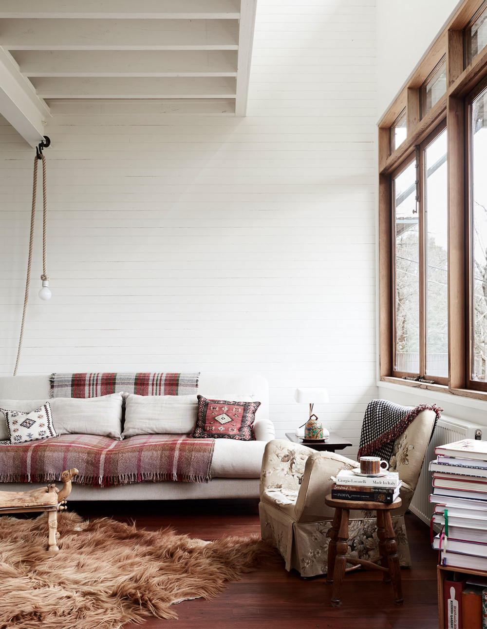
Living area featuring sofa from Scout House, chairs, stool and rugs from markets and auctions, rope light from the Netherlands. Photo – Eve Wilson for The Design Files. Styling – Annie Portelli.

This loft bedroom is the definition of contemporary comfort. I just want to lie on that bed and roll off onto that lush rug! Project by Emily Henderson. Photo – courtesy of Emily Henderson.

This has got to be the dreamiest, cosiest bedroom EVER! Jersey Ice Cream Co has created a room that is humble and at the same time luxurious. Photo – Nicole Franzen.

A Word on Comfort

Creating true comfort in our homes seems obvious, but comfort can be overlooked, as there are so many other requirements we’re considering.

When creating a contemporary country look, comfort is at the core. Bring it on, with plush sofas and banquette seating, fluffy or textured rugs underfoot, *extra* cushions wherever you can squish them, and, in the bedroom, a grand (perhaps four-poster!?) bed!

Not only do we want to feel comfortable, we also want comfort on the eye. That’s why these spaces are harmonious, the colours are natural and tonal, not contrasty or jarring – everything just makes sense.

Illustrator And Designer Mark Conlan On Finding Your Style, And Embracing It!

$
0
0

Illustrator And Designer Mark Conlan On Finding Your Style, And Embracing It!

Studio Visit

Annie Portelli

Irish illustrator Mark Conlan in his studio. Photo – Amelia Stanwix.

Artwork by Mark Conlan.

Mark is a self-taught graphic designer and illustrator! Photo – Amelia Stanwix.

Mark was invited to Adobe MAX Creativity Conference this year. Photo – Amelia Stanwix.

Artwork by Mark Conlan.

Mark has a range of high-profile clients that come to him for his specific design aesthetic. Photo – Amelia Stanwix.

Photo – Amelia Stanwix.

Photo – Amelia Stanwix.

Mark working in Adobe. Photo – Amelia Stanwix.

Artwork by Mark Conlan.

Mark is known for his playful illustration style. Photo – Amelia Stanwix.

Artwork by Mark Conlan.

Details of Mark’s studio. Photo – Amelia Stanwix.

Mark Conlan is a multi-disciplinary illustrator and graphic designer, living and working in Melbourne. He’s lent his warm, playful style to some pretty major companies including The Age, Coca Cola, and The New York Times! Although he had a creative background, he never actually studied graphic design, forging his path without any real ‘rules’ or guidelines.

After I met Mark at the Adobe MAX Creativity Conference in LA last year, we caught up for a chat about his stellar career path – from finding his feet as a designer, to developing his own distinct style.

How long have you been an illustrator, where did it all begin?

Four years now, so it’s still kind of new. I have been in the creative field for a little while now though. I studied hand-drawn and computer animation at university.

After leaving university,  I was so excited about the future. You think ‘Oh yay I’m going to work in this job forever’ and then you realise that there are no jobs out there, so that was really depressing. So I ended up working at Urban Outfitters for a few years where I was able to work as a display artist, so I had a more hands-on approach. I then moved to London and started working as a self-initiated graphic designer.

So you weren’t trained as a graphic designer, but you still worked as one?

Yeah, I just went for it! It was dangerous, but it was fun! I had creativity behind me so that helped BUT of course if I had actually studied graphic design that would have definitely helped to make my life, and the process a lot easier. But there’s so much fun in that too!

If you don’t have all of those rules in front of you, you can just go straight in, there are no barriers.

‘finding your style’ seems to be almost a buzz term at this ADOBE MAX. How did you go about finding yours, what are the challenges?

I don’t think everyone finds their style fully, eventually over years of practising you will evolve and take your work to different places. You may have an ‘identity’ but your style is always rolling through as you start picking up new things along the way which will inevitably evolve your style.

How do you adapt your playful style to the sometimes serious or corporate companies you work with (including Coca-Cola, Bank of Melbourne + The Age). Where’s the balance? Is there a compromise, Or do you just give them everything you’ve got?

I think nowadays, respect has changed for us illustrators, and illustration in general. I think years ago creatives were expected to be a ‘jack of all trades’ and have several styles which they could adapt to different briefs or clients needs. But these days, brands come to the illustrator for their style… so people come to me and hire me because they love my work, and they want my work to speak for their brand. 

Finally, I have to ask you if you have a dream client? Have you been on the cover of the New Yorker yet!?

You know what, I haven’t been in The New Yorker yet, but I guess they would be a dream client! I need to find a contact there. I would love that! (Call out to anyone who has a contact, hit us up!)

Another thing I’ve always dreamed of is getting my work on one of our Melbourne trams, that would be cool. But I’m really into public art, I’d love to do a mural too. Maybe in 2020!

An Interior Designer’s Family Forever Home

$
0
0

An Interior Designer’s Family Forever Home

Homes

by Lucy Feagins, Editor

Therese designed the custom dining table and banquette seating herself, and sourced the dining chairs from Tyabb Antiques market in Mornington. The feature wall is painted in Basic Coral by Dulux with mounted glass wall lights shipped over from the Netherlands. Artwork from Atlas Gallery. Photo – Fiona Storey.

A light-filled hallway. Photo – Fiona Storey.

Walls painted in Natural White by Dulux. Chairs from Tyabb Antiques and re-upholstered in Dedar fabric. Artelier Areti pendant light. Therese is dressed in Flatiron. Photo – Fiona Storey.

Therese designed the custom dining table, glass doors and arches herself and sourced the dining chairs from Tyabb Antiques market. Woodcut floorboards. Photo – Fiona Storey.

The Persian red marble dining table is accompanied by another custom piece, a banquette seat designed by Therese. Photo – Fiona Storey.

Wall and custom curved fireplace is painted in Dieskau by Dulux. Cadry’s rug. armchair is from District Furniture armchair. Grazia & Co coffee table, Zac Koukoravas painting from Flinders Lane Gallery. Therese designed the custom shelving unit to hide the TV behind a perforated screen. A Marshall speaker, small Kerry Armstrong painting and 1960s glass ball table lamp from Atlas Gallery Antiques accessorise the shelf. Photo – Fiona Storey.

Photo – Fiona Storey.

Living room detail. West Elm glass candlestick holders. Therese had the side table (another vintage find) re-sprayed in navy blue. Fanuli sofa. Photo – Fiona Storey.

Earp Bros glazed tiles. Hi-Macs white bench top. Flatiron plum-tinted glass bowls. Calacatta Viola marble splashback. Photo – Fiona Storey.

Armchair and bar stools from District Furniture. Cadry’s rug. Coffee table from Grazia & Co. Blue glazed tiles from Earp Bros. Kitchen benchtop by Hi-Macs. Joinery painted in Dulux Natural White.

Photo – Fiona Storey.

Ribbed walls tiles from Artedomus with Calacatta Viola marble splashback. Flatiron glass bowl sits alongside a vintage brass ornament. Kitchen joinery painted in Dulux Natural White. Photo – Fiona Storey.

A colourful study space. Photo – Fiona Storey.

Walls and joinery in Natural White by Dulux. Custom made bench seat with Dedar velvet upholstery. On the walls are photos of Therese’s work. Photo – Fiona Storey.

A smoky second bedroom in Dieskau by Dulux. Artwork by Sarah McDonald. Nancy Bird bed linen. Douglas & Bec lamp. Photo – Fiona Storey.

Therese inherited the mid-century sideboard that sits in front of walls painted in Shell Blue by Dulux. Judith Wright painting from Sophie Gannon Gallery. Photo – Fiona Storey.

Custom vanity unit with pink quartzite stone top. Brass tapware from Parr Taps. Basin from Highgrove Bathrooms. Photo – Fiona Storey.

Custom vanity unit with stone top and a built-in stone basin designed by Therese. Brass tapware from Parr Taps. Bath towel is from Loom Towels. Floor tiles are from Earp Bros and National Tiles wall tiles. Photo – Fiona Storey.

Whenever a home is up for sale, it’s inevitable a few neighbours will slip into the open for inspection for a sticky beak. This was the case for interior designer Therese Carrodus, but unlike most nosy neighbours, she and her husband ended up buying the property! ‘I just remember first stepping onto the front verandah and suddenly imagining Rosie having her first day of school photo, and later having her school formal photo taken at the front door,’ recalls Therese. ‘It just sort of felt straight away like it was a home I could see the kids growing up in.’

Drawing on her interior design background, Therese immediately saw the home’s potential, recognising its ‘daggy but easily transformable interiors.’ Her approach was to reconfigure the existing floorplan to be more functional, adding a new kitchen, laundry, built-in dining area, and custom glass doors in the living space.

While many period home renovations feature a contemporary open-plan area at the rear, Therese desired a more cohesive look, where the new and old parts of the home would flow seamlessly from room to room. ‘I wanted the overall aesthetic and atmosphere of the house to feel a little bit playful and eclectic, with some bold colour and texture, but at the same time, I didn’t want any of those elements to be overbearing or polarising in any way,’ she says. A bold palette of moody blues, plum and oxblood reds feature throughout the home, with more subtle hues of blush and grey to balance things out.

The renovation was completed in 2018, just 10 days before the arrival of baby Hughie!  As a busy Mum to Rosie (6), Barnaby (3) and Hughie (1), Therese isn’t precious about her home. ‘The kids are often running (and sometimes scooting!) up and down the hallway, as well as making cubby houses in the living area, and just generally making a mess somewhere in the house!’

A Renovated 1930s Home Overlooking Brisbane River

$
0
0

A Renovated 1930s Home Overlooking Brisbane River

Architecture

by Amelia Barnes

The open living pavilion stretches out into the treetops. Photo – Simon Devitt.

Glass reflects the surrounds like a treehouse overlooking the Brisbane River. Steel framed doors and frameless glass by Everingham Wrought Iron. Photo – Simon Devitt.

Panoramic treetop views. Photo – Simon Devitt.

Natural light and shadow contrast in the living space. Photo – Simon Devitt.

Light floods the kitchen and dining space. Photo – Simon Devitt.

Sleek mid-century joinery in the study. Photo – Simon Devitt.

Minimal lines keep the open shelving clean. Photo – Simon Devitt.

The front courtyard connects the two spaces in the living pavilion. Photo – Simon Devitt.

Greenery connects old and new wings of the building. Photo – Simon Devitt.

A serene lap pool is overshadowed by riverside trees. Photo – Simon Devitt.

The 1930s brick and timber facade is maintained. Photo – Simon Devitt.

The Brisbane Riverbank House in Indooroopilly was designed for the specific requirements of a family with a young daughter. The clients were seeking a ‘simple way of living’, including multiple outdoor spaces to entertain family and friends. Owen Architecture founder Paul Owen says the brief was simply to ‘create a building which creates a relaxed and happy family life, that feels natural in its Australian riverside landscape.’

Paul’s approach to renovating the 1930s timber and brick house was to design a new living pavilion, creating two large courtyards in the process. The riverside courtyard is a level lawn, directly accessible from the kitchen and living rooms, both of which overlook the Brisbane River. In contrast, the front entry courtyard is a large paved area bound by garages housing the owner’s extensive car collection. The main living pavilion links these outdoor spaces to one another, creating Paul’s favourite feature of the property.

Earth-based materials such as brick and terracotta were chosen to suit the property’s riverbank context. These materials flow into the interior spaces also, creating a minimal look that draws the eye out to the beautiful river and lawn views.

Owen Architecture has succeeded in introducing major new works to this site without losing the grace of the existing home. The project has been recognised by multiple awards, including the 2019 Houses Awards for House Alteration and Addition over 200m².

Our Biggest Giveaway EVER – A Dream Trip For Two To Vanuatu!

$
0
0

Our Biggest Giveaway EVER – A Dream Trip For Two To Vanuatu!

Giveaway

by Sally Tabart

Havannah Boat House in Vanuatu, perched on the ocean’s edge on Efate Island. Photo – courtesy of Vanuatu Tourism.

Looking out from Havannah Boat House to the crystal waters of Havannah Harbour. Photo – courtesy of Vanuatu Tourism.

The prize package includes a delicious hosted meal with local produce. Photo – courtesy of Vanuatu Tourism.

A villa at Havannah Boat House. Photo – courtesy of Vanuatu Tourism.

Heaven! Photo – courtesy of Vanuatu Tourism.

Inside the luxury accommodation. Photo – courtesy of Vanuatu Tourism.

A villa at Havannah Boat House. Photo – courtesy of Vanuatu Tourism.

Where the pool overlooks the ocean! Photo – courtesy of Vanuatu Tourism.

Pottery and weaving classes. Photo – courtesy of Vanuatu Tourism.

Creative arts are an important part of Ni-Vanuatu culture. Photo – courtesy of Vanuatu Tourism.

Mele Cascades, one of Vanuatu’s spectacular waterfalls. Photo – courtesy of Vanuatu Tourism.

This could be you and a friend in Vanuatu! Photo – courtesy of Vanuatu Tourism.

Made up of over 80 islands, Vanuatu is renowned for its oceans and pristine white sand beaches. Photo – courtesy of Vanuatu Tourism.

Vanuatu is renowned for its rugged natural beauty, rich local culture and of course – the white sandy beaches and crystal-clear ocean waters.

Thanks to Vanuatu Tourism, one TDF reader and their friend will soon touch down in the Pacific Island nation, covering the following dream itinerary over five days!

FLY

Our winner will jet off to Port Vila, located a four-and-a-half-hour direct flight from Melbourne, three from Sydney, and just over two from Brisbane.

Port Vila is Vanuatu’s capital city on the island of Efate. The most comfortable way to get around here is by car, which our winner will receive courtesy of Hertz.

STAY

Just half an hour drive from Port Vila is Havannah Boat House – a secluded private villa nestled on the sheltered waters of the Havannah Harbour. The luxury accommodation offers a variety of diverse experiences and is close to incredible culinary and cultural offerings, including markets, cafes and chocolatiers.

EAT

Venture into the Port Vila’s industrial estate (near the airport) and you’ll find community cafe, K2. The cafe is set up in shipping containers, uses local produce and is mostly frequented by locals, making it all the more special for tourists to discover. Make sure to grab a coffee using locally sourced and brewed coffee beans from the nearby volcanic island of Tanna.

Our winners will enjoy a delicious catered dinner made by the cafe, hosted directly on the Havannah Boat House site. K2 also provides catering across the island – meaning you can order directly to your villa!

DO

It wouldn’t be a TDF itinerary without something creative!

Havannah Boat House has its very own studio where local experts teach regular workshops on pottery, weaving and screen printing. Our winners will have the opportunity to make their own beautiful wares with a local artisan at a complimentary workshop that covers pottery, weaving and fabric painting.

There’s also a stunning pool on site to unwind and relax, and a private jetty extending to the beautiful Havannah Harbour.

If getting out in the action is more your thing, there are plenty of incredible activities across the island that you can really explore with a car. Foodies can make a pit stop at Gaston Chocolatier, makers of incredibly fine quality produced from pure single-origin Vanuatu cocoa.

Pick up some local handicrafts and support the community at Mama’s market, a marketplace that showcases the local weaving styles of the island.

There are so many amazing places to cool down and have a dip across the island – from dazzling Eton Beach to the Mele or Lololima cascades.

THE PRIZE

Thanks to Vanuatu Tourism, we are SO excited to offer one lucky reader the most epic giveaway in TDF history: a trip for two people to Vanuatu with flights and accommodation.

Included is:

– Return flights for 2 people to Vanuatu from Sydney, Melbourne or Brisbane (blackout periods apply including school holidays and pending availability)
– 4 x nights at Havannah Boat House for two people (dates subject to availability from May – December 2020)
– 1 x pottery/fabric painting/weaving class for two guests
– 1 x hosted meal by K2 Kitchen for two guests
–Hertz car hire for the duration of the stay (5 days)

To enter, tell us in 25 words or less why Vanuatu is your dream holiday destination in the form below. Entries will close on Thursday February 13th at 5pm (AEDT). Winners will be notified on Friday February 14th. Please read the terms and conditions for more information + conditions of entry.

For more spectacular accommodation, breathtaking places to visit and things to do on your next holiday, visit the Vanuatu Tourism website here.


A Home That Blends Seamlessly Into Its Bushy Surrounds

$
0
0

A Home That Blends Seamlessly Into Its Bushy Surrounds

Architecture

by Sally Tabart

Photo – Jane Poynter. Styling – Nina Provan.

Photo – Jane Poynter. Styling – Nina Provan.

Photo – Jane Poynter. Styling – Nina Provan.

Photo – Jane Poynter. Styling – Nina Provan.

Photo – Jane Poynter. Styling – Nina Provan.

Photo – Jane Poynter. Styling – Nina Provan.

Photo – Jane Poynter. Styling – Nina Provan.

Photo – Jane Poynter. Styling – Nina Provan.

Photo – Jane Poynter. Styling – Nina Provan.

Located in Ocean Grove, a Victorian seaside town just over an hour and a half from inner Melbourne, this home was originally designed for a local builder and his young family.

When Josh Crosbie Architects were tasked with this project, the site was flat and vacant, bordering a nature reserve. ‘It was really important to our clients that harmony existed between the house and the surrounding natural environment’, Josh Crosbie tells. Genuine care to make as little impact as possible was a top priority, and the home was designed to ensure that no trees would need to be removed from the site, and even dead trees were left alone, to help protect the native wildlife habitat.

The house itself is impressive and dynamic, both aesthetically and functionally. The client’s ‘passion for irregular shapes’ and desire for a large family home informed a unique design for the dwelling, comprising two triangular forms separated by a large feature curved rammed earth wall. This wall is a defining feature of Yellowgums both inside and out, splicing through the home and drawing apart in the middle to reveal the central kitchen.

Huge glass doors and windows leading from the living spaces out onto the deck make the most of the block’s northern orientation. This, combined with a floor made of a burnished concrete slab, absorbs the winter sun to naturally help regulate the internal temperature. Solar panels, recycled hardwood and a rainwater tank are incorporated into the build.

A simple but strong facade has been achieved through native hardwood cladding of Silvertop ash, which blends elegantly and naturally into the surrounding landscape.

An Architect’s Self-Designed Butterfly Home!

$
0
0

An Architect’s Self-Designed Butterfly Home!

Architecture

by Amelia Barnes

‘Rather than a street statement, the drama unfolds upon entry where the architecture truly reveals itself. Houses are for living in and looking out of, more than looking at!’ Simon explains. Photo – Michael Kai.

Rigid lines are made satisfyingly asymmetrical by the sloping roof. Photo – Michael Kai.

Black steel and extensive glazing is offset by oak timber joinery. Photo – Michael Kai.

As the outline of the existing home was preserved, the former skillion roof became a butterfly roof. Photo – Michael Kai.

A timber-clad ceiling spans the living, dining and kitchen space. Photo – Michael Kai.

Curved walls and orb lampshades soften the lines of the dining area. Photo – Michael Kai.

Rigorous geometry meets aspects of unexpected whimsy. Photo – Michael Kai.

Sunshine bouncing off the terrazzo floors and oak timber cabinetry brightens the bathroom. Photo – Michael Kai.

Bedroom detail. Photo – Michael Kai.

Oh, the geometry! Photo – Michael Kai.

An oasis of greenery. Photo – Michael Kai.

The property’s mid-century origins are referenced in the uniform use of concrete blocks throughout. Photo – Michael Kai.

The sombre palette of black and charcoal is designed to make the garden greenery pop. Photo – Michael Kai.

The Butterfly House in Sandringham is the family home of architect Simon Perkins, director at Pleysier Perkins. With no time or client constraints to adhere to, Simon took his time designing this home, with the input of all his practice’s team members along the way.

The opportunity to essentially design his own home allowed Simon to take some risks, the first being how the house was extended. Simon says while ‘conventional wisdom may have included demolishing the original house and building a much more efficient two-storey structure’, he designed the new addition to essentially mirror the existing house.

The original footprint was largely maintained, but with all the internal walls replaced. Within this newly configured floorplan is now the parents retreat and their daughter’s bedroom. ‘Its black colour is designed to accentuate the greenery of the new garden and vines,’ explains Simon. The new ‘box’ at the rear accommodates the son’s bedrooms, and a games room leading to a poolside deck.

As the outline of the existing home was preserved and essentially mirrored in the extension, the former skillion roof became a butterfly roof, floating over the two built forms. The family areas including the kitchen, meals and lounge are all located under this new timber clad ceiling forming the centrepiece of the house.

Simon’s house continues the Pleysier Perkins tradition of showcasing very little from the street, so as to avoid a double car garage dominating the front facade. Simon explains, ‘Rather than a street statement, the drama unfolds upon entry where the architecture truly reveals itself. Houses are for living in and looking out of, more than looking at!’

Sharp lines, black steel and extensive glazing are offset by soft grey interior walls, oak timber, and the occasional pop of colour. Rigorous geometry meet aspects of unexpected whimsy, such as the bathroom, with coloured grout and a pink basin!

The property’s mid-century origins are referenced in the uniform use of concrete blocks throughout, and the landscape design by Matt Walsham, inspired by a recent trip to Los Angeles and Palm Springs.

By working with the existing house on site, Pleysier Perkins, in collaboration with their builder Kleev Homes, have designed a more creative house. ‘The result is totally unique,’ says Simon. ‘It’s a house that works very well but could never have been imagined from a Tabula rasa (clean slate) site.

Contemporary Ceramics That Look Like Ancient Relics, By Emily Brookfield

$
0
0

Contemporary Ceramics That Look Like Ancient Relics, By Emily Brookfield

Creative People

Sasha Gattermayr

Ceramicist Emily Brookfield in her Yarra Valley studio.

Photo – Emily Brookfield.

Photo – Emily Brookfield.

Photo – Emily Brookfield.

From bulbous, pistachio-hued vessels and baby pink cylindrical vases, each unique piece by Yarra Valley based ceramicist Emily Brookfield  is textured with hand-carved indentations that feel almost prehistoric. As Emily says, ‘I’m inspired by how old the art form is, ceramics is ancient!’

Since beginning a Fine Arts degree and discovering the conceptual side of ceramics, Emily has shifted her practice to focus on sculptural exploration. Her pieces evolve as she learns more about the craft. Emily’s first solo show, In Conversation, was held late last year at Brunswick Street Gallery, and she has more in the pipeline for this year!

Hey Emily! Your pieces are so colourful and unique, how did you start making ceramics? What has been your creative journey so far?

I have always felt the need to be creative in some way. I’ve worked in visual merchandising and styling, and I’ve even tried my hand at illustration, but nothing really held my interest the way ceramics has.

The first class was so much harder than I thought it would be. I went into it like so many others do, thinking that I’d leave after one lesson with a finished cup. I was definitely determined to keep going and I ended up quitting my retail job to help out at the studio for a short while to learn as much as I could!

I then started Emily Only, with a focus to create homewares made in small batches. I took my wares to markets around Victoria, and then felt that I needed to push my practice further, so decided to go back to study. I’m going into my second year at RMIT studying a Bachelor of Fine Arts with a Ceramics specialisation, which has completely changed the way I work with clay. I’m shifting my focus towards sculptural pieces, but I feel there will always be an element of my work that is functional in some way.

Where do you create your work?

I work from a spare bedroom in my home out in the Yarra Valley. It’s a small space but there’s enough room for my wheel, a kneading table and some shelves and that’s really all I need. I do also have a small kiln out in my shed that I use for bisque firings as well.

What do you love about what you do?

I love working with my hands and seeing the piece come together and evolve. You don’t realise how much your style changes and improves until it’s in front of you. I also love that the medium is so versatile yet fragile at the same time. I was told by my first teacher that you will never know everything about ceramics. Not even masters know everything about it.

There’s no real formula for making something, only guidelines, so there’s a lot of trial and error, even with things you know and have made so many times. The fact that chance plays a huge part in it is exciting.

Do you have any key references or inspirations?

I’m inspired by our connection to objects and why we become so attached to certain things. Being able to tell a story through an object is fascinating to me.

Keep up with Emily’s exhibition news on Instagram and view her amazing collections on her website.

A Driveway-Turned-Boutique Accommodation In Daylesford

$
0
0

A Driveway-Turned-Boutique Accommodation In Daylesford

Stays

Sasha Gattermayr

‘I created a place with not only personal collections but a unique, open-plan space with trees, plants and one-off finds.’ – Lynda Gardener. Photo – Marnie Hawson.

‘White, bright, old and new’ was Lynda’s plan for the interior from day one. Photo – Marnie Hawson.

Lynda Gardener. Photo – Marnie Hawson.

‘All my properties have my own collections [in them].’ Photo – Marnie Hawson.

‘I salvaged huge windows from a schoolhouse, custom-made large barn doors front and back and, most recently, added a custom-made glasshouse to the rear of the property.’ Photo – Marnie Hawson.

A fully equipped weekend getaway kitchen. Photo – Marnie Hawson.

Kitchen detail. Photo – Marnie Hawson.

Bags and baskets perfect for market shopping hang on the wall. Photo – Marnie Hawson.

Textiles and indoor greenery add bursts of colour. Photo – Marnie Hawson.

The bathroom pod walls act as dividers between the bedroom and living room in the open plan space. Photo – Marnie Hawson.

A light-filled reading nook. Photo – Marnie Hawson.

A bedside corner in earth-toned hues. Photo – Marnie Hawson.

Inside the central bathroom pod. Photo – Marnie Hawson.

Custom barn doors and a pitched roof evoke the tradition of Daylesford’s country heritage. Photo – Marnie Hawson.

‘I renovated and styled my first project approximately 15 years ago in Daylesford. I wanted a house in the country and Daylesford always appealed!’ Photo – Marnie Hawson.

Long, winding roads and proximity to Melbourne are pluses! Photo – Marnie Hawson.

It starts like a fairytale. At the rear of a property in Daylesford lay a rarely-used driveway, fallen into disrepair and overgrown with trees and long grass.

This is the spot interior designer Lynda Gardener came across two years ago and decided was perfect for her next project. She convinced the surprised owners to sell the strip of gravelly land at the back of their property, and at the end of last year Lynda’s tiny barn was built, styled and ready for visitors.

‘I knew instantly it had to be simple and open plan,’ she says of the design. ‘I stuck to my vision and completed a contemporary barn, totally open plan, except for a central pod which housed the bathroom.’

Despite designing four previous accommodations, ‘Room + Board‘ is the first project Lynda has completed as a new build, making it completely different to the old houses and apartments she has previously overhauled. The timber trusses and pitched roof elevate the height of the structure and were intended to give a lofty, barn-like feel to the single-room space.

By using greenhouses and barns as reference points, Lynda has created a light and airy space, which still evokes the country heritage of the surrounding area. Huge recycled windows salvaged from an old schoolhouse complement custom-made barn doors at the front and back of the accommodation, while Lynda’s own collection of antiques and vintage finds fill the whitewashed interiors.

‘White, bright, old and new’ was her plan for the interior from day one, and she stuck to it. ‘Simple, clean lines filled with cosy, feel-at-home furniture’ was crucial to making the accommodation inviting and relaxing. Considering Lynda manages the bookings and greets all her guests individually, an at-home ambience was an important feel to get right.

Thoughtful additions to the exterior of the property extend the living space beyond the barn. A custom-made glasshouse was erected for lounging and reading in the garden, and an old tin bath sits on the back verandah for soaking at the end of a long day!

Room + Board Daylesford is available now for short term stays via Airbnb! Lynda also operates a number of other beautiful boutique properties, renovated in her distinct style. Check out The White House in Daylesford, and The Estate in Trentham.

A Monolithic Yet Sensual New Furniture Collection From Sarah Ellison

$
0
0

A Monolithic Yet Sensual New Furniture Collection From Sarah Ellison

Furniture

by Amelia Barnes

The HUGGY Chair in Faux Shearling. Photo – Dave Wheeler.

MUSE Modular 3-Seater + Ottoman. Photo – Dave Wheeler.

TIDE Coffee Table (Oak), MUSE Modular 2-Seater, and HUGGY Chair in Caramel Velvet, SOL Wooden Ball. Photo – Dave Wheeler.

Ceramics and lighting in the SOL collection. Photo – Dave Wheeler.

EARTH Dining Table, and EARTH Dining Chairs. Photo – Dave Wheeler.

EARTH Dining Table (Round), and EARTH Dining Chair. Photo – Dave Wheeler.

HUGGY Chair in Faux Shearling. Photo – Dave Wheeler.

The collection was shot in the Glebe House by Chenchow Little Architects. Photo – Dave Wheeler.

‘Monolithic’ and ‘sensual’ aren’t adjectives frequently used in conjunction, but in the context of Sarah Ellison’s latest furniture collection, they make total sense.

SOL‘ is Sarah’s third furniture collection since the launch of her design studio in 2017. Prior to this career shift, Sarah was the style editor at Real Living magazine for 10 years, and she has a background in fashion design.

As the name suggests, this collection is inspired by the Roman god of the sun and ideas of warmth and permanence. The sculptural shapes and nostalgic colours express these qualities, whilst also offering a firm nod to the 1970s, a trend which is showing no signs of slowing down in Australian interiors.

This collection marks the first time timber has featured heavily in Sarah’s work, with warm oak used on chairs and tables. One standout piece is the Tide coffee table, available in both limestone and timber variants. ‘I played with scale to create some juxtaposition between the weightiness of the legs and the razor-thin tabletop,’ Sarah explains of this distinctive design.

The substantial proportions and rounded edges of pieces such as the Muse modular lounge draw on Sarah’s affection for 1970s interiors schemes, as well as the work of Italian architect and designer, Mario Bellini. ‘I love the way he played with scale and proportion to create drama’ Sarah says.

There’s also ceramic lighting and vase items in the collection, that adopt a playful yet sophisticated look, reminiscent of Jean Royère’s aesthetic.

SOL is available now!

The Magazine Editor Turned Ceramicist, Using Clay As Therapy

$
0
0

The Magazine Editor Turned Ceramicist, Using Clay As Therapy

Studio Visit

by Sally Tabart

Artichoke magazine editor and passionate ceramicist Cassie Hansen. Photo – Amelia Stanwix for The Design Files.

‘Clay is my antidote to screens and scrolling, and to my own internal hurried, anxious pace that I get swept up in some days’, Cassie says. Photo – Amelia Stanwix for The Design Files.

Cassie works from her sweet little backyard studio at home in Kyneton. Photo – Amelia Stanwix for The Design Files.

‘It often starts with sketches’ says Cassie of her process. Photo – Amelia Stanwix for The Design Files.

When Cassie and her husband lived in Melbourne, she handbuilt at a tiny desk, using a wheel 20 minutes away from her house. Now she can pop out to the backyard to get her fix! Photo – Amelia Stanwix for The Design Files.

Throwing a vessel on the wheel. Photo – Amelia Stanwix for The Design Files.

Pieces ready for firing. Photo – Amelia Stanwix for The Design Files.

As a magazine editor, Cassie has absorbed and observed her fair share of great design over the years. Photo – Amelia Stanwix for The Design Files.

A collection of vessels, inspired by architectural forms. Photo – Amelia Stanwix for The Design Files.

A sweet studio corner. Photo – Amelia Stanwix for The Design Files.

Studio rules! Photo – Amelia Stanwix for The Design Files.

Cassie with her dog Jimmy (who knows to wait until the wheel has stopped for a pat!) in her backyard studio. Photo – Amelia Stanwix for The Design Files.

Spending the last seven years ‘publishing good design, interviewing designers and thinking critically about design’ as the editor for interior design and architecture magazine Artichoke, Cassie Hansen found herself yearning for her own creative outlet. After her first beginner’s pottery course three years ago, she spent most of her weekends at the studio working on her skills. A year later, she took a one-year studio program at the School of Clay and Art (SOCA).

From her studio in Kyneton, where she’s recently made the ‘tree-change’ from inner Melbourne with her husband, Cassie creates delicate functional ceramic vessels that play with shape and form. It’s easy to see the influences she’s absorbed from all those years of covering excellent architecture, elements of which she translates brilliantly to her pieces.

We recently caught up with Cassie at her home studio, to learn more about her burgeoning ceramics practice, her influences from Japanese and midcentury architecture, and treating pottery as ‘a form of therapy’. 

Hey Cassie! Congrats on the launch of your ceramics practice. How do you juggle this new practice, alongside your role as editor of Artichoke? Do you feel like you have a good balance?

I try to dedicate at least two days a week to ceramics – of course that goes better some weeks more than others. I went from full-time at Artichoke to part-time – I’m still the editor but have learnt to be very efficient with my time in the office now. I’m exceptionally lucky to be in a position to work part-time at Artichoke, and give the ceramics a go. The two complement each other – when I’m in the studio, I’m thinking about architecture and shapes and shadows I’ve come across at work that might inform an element of one of my pieces, and when I’m at the office, I can relate in some way to the design process of others. It all feeds back into each other.

Can you tell us the space where you create?

My studio is at home in Kyneton, in a little spare bedroom separate from our house. I’ve got a wheel in there, a work bench, shelves and a little kiln – everything I need and nothing more. When we lived in Melbourne, I handbuilt from a tiny desk in our house, and used a wheel at a pottery studio twenty minutes away, so I feel pretty lucky to have my own space.

When I’m in the studio working on the wheel, my dog Jimmy sits by my feet waiting for the wheel to stop. He knows I can’t pat him with my muddy hands until I’ve finished what I’m working on, turned off the wheel and wiped my hands.

I know you’ve recently relocated from Melbourne to Kyneton. What prompted the move, and how do your new surroundings inspire/inform your work?

My husband had been wanting a treechange for quite a few years prior to our move, but I took some convincing. Ultimately, we wanted a house and a backyard, and we couldn’t afford that in inner Melbourne. We’d been visiting Kyneton for weekends away for years, we got married here, so it was special to us, I was just nervous about the commute to work. But since the very first day we arrived, I’ve loved it here. We’ve made so many friends here (you can’t walk into Kyneton Woolies without bumping into about six people you know) and there are quite a few amazing potters here too (check out Sharon Alpren, Fork Ceramics and Minaal Lawn) who, like all potters, have been so generous and welcoming.

Tell us about your creative process.

It often starts with sketches. Mid-century and Japanese architecture inspire my work so I refer to books and imagery of these type of buildings, taking note of interesting shapes and compositions – sometimes the circular porthole window of a building might inform a spout on one of my jugs, or the geometry of a floorplan might inspire a handle. I sketch the idea out, refine it some more and then get on the wheel and create the vessel itself. Then I handbuild other elements, like the spouts and handles, and attach those until it what I intended in my sketch.

What do you love about what you do?

Clay has been like a form of therapy for me. When I’m in the studio, deep in the creative zone, it’s like meditation. Hours go by and I haven’t noticed. Clay is my antidote to screens and scrolling, and to my own internal hurried, anxious pace that I get swept up in some days. It’s tactile, it’s visceral, it’s slow, it’s unpredictable, it forces you to be in the moment – clay can provide everything that we don’t allow ourselves when “busy” takes over.

I read this interview with ceramicist and writer Edmund de Waal where he was asked what he loved about making with clay, and he said “It returns me to who I want to be, which is a fully present human being.” Clay really does have that ability.

Cassie sells her work online in very limited numbers – be sure to sign up to her mailing list to find out when new pieces are available, and follow her on Instagram.

This Guerilla Street Art Exhibition Is Targeting Australia’s Inaction On Climate Change

$
0
0

This Guerilla Street Art Exhibition Is Targeting Australia’s Inaction On Climate Change

Art

Sasha Gattermayr

From left. Posters by Lotte Smith, Stanislava Pinchuk and The Lazy Edwin.

Image by Adam Scarf. Poster by Fuzzhead.

From left. Posters by Ghostpatrol, Leans and Fuzzhound.

Image by Luke Shirlaw. Posters by anonymous artists.

From left. Posters by anonymous artist, Workers Art Collective and Wordplay Studio.

Poster by Makatron. Image by Adam Scarf.

The artists who launched it are calling it Australia’s ‘largest unsanctioned outdoor art exhibition’. Over the last week, 78 advertising boards in public spaces like bus shelters, tram stops and information booths in central business hubs were stripped of their paid advertising posters and replaced with bespoke artist renderings calling for ‘Real climate action now’. The guerrilla art campaign was launched by a collective of 41 Australian artists, and is ‘a direct reaction to the feelings of hopelessness and powerlessness experienced nationwide in recent weeks’.

Most of the posters allude to Australian cultural products, niche idioms and iconic images. A sooty Blinky Bill dashes from a looming blaze, a mural of Scott Morrison drinking cocktails in Hawaii is sprayed across a brick façade, and a Caramello Koala melts in the heat. By calling on Australian nationalism, and implying the destruction of these cultural icons, the posters reference a brand of rhetoric politicians have employed in their climate change denialism.

The collective particularly object to the country’s newspaper monopoly, which they accuse of misrepresenting climate science. ‘Beyond bushfires, the intervention speaks more broadly to the use of conventional advertising space in Australia’ they said in a statement.

With a combined reach of 700,000 on social media, the artists hope to use their own platforms to ‘question the position of the media landscape in Australia, and its coverage of issues concerning climate change’ on a more direct level. No dilution of the message through mainstream media outlets can occur when the media is your own.

Each poster holds a QR code which, once scanned by a phone camera, directs the user to one of 30 environmental charities and non government organisations including the World Wildlife Organisation and Bush Heritage Australia.

Participating Artists include Georgia Hill, Tom Gerrard, Sarah McCloskey, Amok Island, Andrew J Steel, Blends, Callum Preston, Cam Scale, Damien Mitchell, Dani Hair, DVATE, E.L.K, Ed Whitfield, FIKARIS, Fintan Magee, HEESCO, JESWRI, Ghostpatrol, Leans, Lluis fuzzhound, Lotte Smith, Lucy Lucy, Makatron, Michael Langenegger, Peter Breen, The Workers Art Collective, Stanislava Pinchuk, The Lazy Edwin, Thomas Bell, Tom Civil, WordPlay Studio, Peter Breen and many more artists and creative professionals who have chosen to remain anonymous.


A 1960s Penthouse With Magic + Zing!

$
0
0

A 1960s Penthouse With Magic + Zing!

Homes

by Lucy Feagins, Editor

Tessa the dog. SBW Halo sofas and chairs. Landscaping by WOWOWA, In Design Company, Cultivate Nursery & Gifts. Photo – Martina Gemmola. Styling by Ruth Welsby.

Ros Willett and Tess. SBW Halo sofas and chairs. Landscaping by WOWOWA, In Design Company, Cultivate Nursery & Gifts. Photo – Martina Gemmola. Styling by Ruth Welsby.

Mattioli flooring. Tiles from. The City TilerSBW Halo chair and stool. Photo – Martina Gemmola. Styling by Ruth Welsby.

Custom barbecue joinery by WOWOWA. Light from Koda Lighting. SBW Halo stool. Photo – Martina Gemmola. Styling by Ruth Welsby.

Custom barbecue joinery by WOWOWA. Light from Koda Lighting. SBW Halo stool, chairs and sofa. Photo – Martina Gemmola. Styling by Ruth Welsby.

Interior design and custom joinery design by WOWOWA. Joinery by Evolve Interiors. Falcon Chair from Modern Times. Sofa by Jardan, Loom rug, SBW ottoman and coffee table. Photo – Martina Gemmola. Styling by Ruth Welsby.

Interior design and custom joinery design by WOWOWA, built by Evolve Interiors. Photo – Martina Gemmola. Styling by Ruth Welsby.

Interior design and custom joinery design by WOWOWA, built by Evolve Interiors. Photo – Martina Gemmola. Styling by Ruth Welsby.

Interior design and custom joinery design by WOWOWA built by Evolve Interiors. Crisp light by Rich Brilliant Willing from Koda Lighting. Appliances by Fisher & Paykel. Iriede tiles from Academy Tiles. Photo – Martina Gemmola. Styling by Ruth Welsby.

Vintage drinks tray and coasters. Iriede tiles from Academy Tiles. Mapei jade green grout. Photo – Martina Gemmola. Styling by Ruth Welsby.

Kai Kristiansen Model 42 chair from Modern Times. Crisp wall light by Rich Brilliant Willing from Koda Lighting.  Iriede tiles from Academy Tiles. Parquetry floors by Andrew Urbaniak. Photo – Martina Gemmola. Styling by Ruth Welsby.

Bitossi ceramics. The vintage original ’60s painting and ’70s pewter wine goblets are both family hand me downs. Photo – Martina Gemmola. Styling by Ruth Welsby.

Akoya 14 pendant light by Rich Brilliant Willing from Koda Lighting. Photo – Martina Gemmola. Styling by Ruth Welsby.

‘Zeus’ artwork by Heather Stewart. Falcon Chair from Modern Times. Sofa by Jardan. Loom rug. Photo – Martina Gemmola. Styling by Ruth Welsby.

‘Fish Mouth’ artwork by Richard Glasson. Gouge artwork by Sara Willett. Tuscan Watercolour artwork by Dorothy Cuming. Bridget Bodenham vase. Photo – Martina Gemmola. Styling by Ruth Welsby.

Brick base on fireplace by Brickworks. ‘Fish Mouth’ artwork by Richard Glasson. Gouge artwork by Sara Willett. Tuscan Watercolour artwork by Dorothy Cuming. Bridget Bodenham vase. Nicolette Johnson vase.  Photo – Martina Gemmola. Styling by Ruth Welsby.

Rug by Halcyon Lake. Sofa by Jardan. Coffee table and yellow chair by SBW. Original drawings by Virginia Hodgkinson. Vintage French lamp from Angelucci 20th Century. Tretford peacock carpet from Gibbon Group. The leather wingback is a vintage ’60s family hand me down that’s been reupholstered. Vintage Featherston Contour Chair purchased Luther & Co. Photo – Martina Gemmola. Styling by Ruth Welsby.

Philippe Starck pendant. Interior design and custom joinery design by WOWOWA built by Evolve Interiors. Tretford peacock carpet from Gibbon Group.  Photo – Martina Gemmola. Styling by Ruth Welsby.

Tretford peacock carpet from Gibbon Group. H. W. Klein for Bramin vintage leather swivel chair by purchased by Modern Times. Portrait by Richard Glasson. Photo – Martina Gemmola. Styling by Ruth Welsby.

Wall light by Mondoluce. Figurative paintings by Virginia Hodgkinson. Photo – Martina Gemmola. Styling by Ruth Welsby.

Adeona mosaic tiles from Academy Tiles. Velvet curtain from Bradley’s Curtains & Blinds. Crisp wall light by Rich Brilliant Willing from Koda Lighting. Photo – Martina Gemmola. Styling by Ruth Welsby.

Custom joinery design by Wowowa built by Evolve Interiors. Photo – Martina Gemmola. Styling by Ruth Welsby.

Rosalind Willett has long called St Kilda home. The managing partner of Willett Marketing was living nearby when this apartment went up for sale, and despite not being in the market for a new home at the time, she was instantly taken with its sensational ‘60s features. ‘Our family was at a stage that living in an apartment close to the city and transport was very convenient’ she says, ‘we couldn’t resist.’

Rosalind’s apartment is the penthouse of her building (a block of 16) that was originally the builder’s own family home. It’s definitely not your typical shoebox apartment, but a four-bedroom, two-bathroom haven with multiple living spaces and even a rooftop terrace. They don’t make them like this anymore! 

‘It has a beautiful aspect across to the city and neighbouring rooftops, trees and the Sacred Heart Mission,’ says Rosalind of her rooftop oasis. ‘The bird life is spectacular – magpies, currawongs and parrots come to drink from a bird bath I have and they love the new flowering native trees.’ 

After living here for eight years, Rosalind set out to renovate with the team at Wowowa Architects. The plan was to retain any original ‘60s elements (such as the glass doors, windows and dividers throughout) but otherwise give the place a serious facelift. 

The renovations saw new joinery, flooring, carpet, heating, cooling and lighting added to the apartment. The kitchen, bathroom, and terrace were completely renovated, while the upstairs living room was redesigned with joinery pieces, timber slats, and ceramic tiles on the chimney. 

Never ones to play it safe, Wowowa encouraged Rosalind to experiment with colour to add some magic and zing! ‘They were an inspiration, and pushed me to go with things I wouldn’t have thought of, or ordinarily been brave enough to do,’ she says. ‘Working with architects and interior designers brings magic to your home and the value of that can’t be measured.’ Among the many spectacular details are the superb green kitchen cabinets, the yellow striped awning  over the terrace, and peacock coloured carpet. Brass finishes in nearly every room provide a sophisticated touch, tying the entire space together. 

Rosalind currently shares this home with her son, jazz musician Jack Hosking, and his partner HR Manager Irene Censini, who are living here while they save for a property of their own. ‘The apartment remains a comfortable space for the family, bringing joy to all those who frequent it,’ Rosalind says, ‘It’s tactile, delightful to look at and be in, or as Mon [Wowowa architect Monica Woodward] would say, it’s thoroughly delicious.’

Painting Emotional Landscapes With Sophie Perez

$
0
0

Painting Emotional Landscapes With Sophie Perez

Art

Sasha Gattermayr

Between Trees and Memories by Sophie Perez.

Photo – Willow Creative Co.

Take me somewhere new by Sophie Perez.

Remember me by Sophie Perez.

Linen Tree by Sophie Perez.

Where we belong by Sophie Perez.

Symphony of Paint by Sophie Perez.

Fields of Gelato by Sophie Perez.

It’s ‘the endless possibilities and the rich natural habitats’ that surround Sophie Perez which serve as the primary inspiration for her paintings. The reflections of deadwood tree trunks glint across the surface of a billabong, paperbark dangles from the spindly arm-like branches of a gumtree, and brown kangaroo grass ripples in the breeze. In the whimsically-titled Fields of Gelato, brushstrokes map scoops of rolling, colourful hills that disappear into an ocean horizon.

These are scenes of stillness. Fleeting moments that give a sense of capturing time in motion, and revelling in its transience. They are ‘a gentle reminder of nature at its best’.

Sophie’s landscapes are inflected by memory and emotion, manipulated by the distance of time, but brightened by the sharpness of feelings associated with the place. ‘Before I begin putting brush to canvas, I can already see how I want it to work,’ she says of the importance of memory. ‘The emotion of the moment is really important to me.’

The artist works from her Mornington studio, which is flooded with natural light and open to visitors. Her community is also welcome to join the artist for a one night only event at her upcoming exhibition, Conversations in Time, in Richmond. On February 15th Sophie will host a long lunch in the exhibition space, where likeminded people can gather to talk about art, around a three-course Moroccan feast by Mr Curtis in Mount Martha, and paired with Mornington Peninsula wines. Tickets will be available for 12 guests and part of the ticket proceeds will be donated to Red Cross Australia Disaster relief appeal.

Sophie’s next project will be to head to the Pilbara in Western Australia in the middle of the year, where her watery green creeks and hills will give way to arid desert sands. It’s a chance to commune with other artists, experiment with new mediums and see things she has never seen before.

Conversations In Time by Sophie Perez 
February 8th – 29th 
The Lennox
208 Lennox Street
Richmond, Victoria

A Landscape Designer’s Own Ever-Changing Garden

$
0
0

A Landscape Designer’s Own Ever-Changing Garden

Gardens

by Sally Tabart

Landscape designer Kathleen Murphy and her family in their ever-changing garden. Photo – Marnie Hawson.

Kathleen has designed over 300 gardens in 14 years! Photo – Marnie Hawson.

With the help of local handymen Matt Davies and Geoff Hines, Kathleen brought the studio she designed to life. Photo – Marnie Hawson.

Robust native grasses, along with succulents and shrubs are key to Kathleen Murphy’s studio garden. Photo – Marnie Hawson.

The garden captures a spectacular view of the Macedon Ranges. Photo – Marnie Hawson.

A garden to be lived in! Photo – Marnie Hawson.

Kathleen created a billabong running through the garden! Photo – Marnie Hawson.

Photo – Marnie Hawson.

The subtle hues and textures of Australian natives are constant references for Kathleen. Photo – Marnie Hawson.

Playful areas abound in Kathleen’s garden. Photo – Marnie Hawson.

Pink roses in the garden. Photo – Marnie Hawson.

Kathleen incorporates soft furnishing elements like outdoor furniture and pots into the balance of her design. Photo – Marnie Hawson.

A magical corner of the garden. Photo – Marnie Hawson.

‘We try and design gardens that are unique, that feel special and engage clients with their gardens, inspiring them to be out in nature’ says Kathleen. Photo – Marnie Hawson.

Photo – Marnie Hawson.

There is something rather magical about the gardens landscape designer Kathleen Murphy creates. Balancing refined landscaped areas, with robust, textural layers of plants that appear as though they might have always been there, these are spaces which expertly complement the dwellings they surround. They’re gardens to be lived in, not just looked at.

We chat with the Irish-born, Gisborne-based landscape designer about her most personal project yet – her own studio garden!

Hey Kathleen! We really love the gardens you make. What are the key aspects you consider when approaching a new project?

Firstly I like to understand what the client is looking for and what their needs are.  

Secondly,  I like to link the house to the wider landscape where possible, taking into account views from each window ensuring your eye is always directed out into the garden. This then informs the design and its key accent lines and features.  

Thirdly it’s essential to link the architecture of the home to the landscape. I do this by using a similar colour palette in hard landscaping materials, like in the choice of paving, or in soft furnishings like outdoor furniture or pots.

Structural elements of the garden may draw on certain architectural lines of the house. I aim to have a harmonious conversation between the house and landscape, each complementing and enhancing the other.

Are there any major inspirations, references or plants that influence your designs?

The subtle hues and textures of Australian natives. I am drawn to soft greys, greens and purples as base colours – they seem to work well in the Australian light. Natural materials like rock, gravel, timber and water feature heavily in most designs, as do curves and asymmetry – however, an overriding theme is balance.

We try and design gardens that are unique, that feel special and engage clients with their gardens, inspiring them to be out in nature.

What kind of feeling/environment were you trying to create with this project – your own studio garden? 

My vision for my own garden was to frame the amazing view we have of the Macedon Ranges and to nestle the studio into the landscape. I designed the garden as much from what it looked like inside the house, looking out onto the garden. The steppers across the billabong have been positioned so that they can be seen from the kitchen sink!

This garden is essentially a family garden, catering to three kids with bikes, footballs and random running all over plants! Everything is tough, and drought and frost hardy. If it doesn’t survive, it doesn’t get replanted! I use this garden as a place to experiment with plants before I use them in other projects, hence it never looks the same and is always changing. Clients get to see first hand what some of the plants I am suggesting look like, and how they behave.

What are some of the key materials and plants you used here? 

The key plants are native grasses, such as Lomandra species, as they look good all year round and are low maintenance. I have used clumps of succulents and shrubs, like clipped Westringia and prostrate Rosemary, for texture.

Adding colour is often done in my garden through the use of perennial plantings, which require more maintenance and need to be cut back in winter, however, I just love the Verbena bonariensis, Salvia nemorosa and Pervoskia their purple hues which work well with soft muted greens and greys.

What was the most challenging part of this project, and how did you overcome it?

The most challenging part of the project was actually building the billabong. The sourcing of clay and rocks was difficult. The placement of materials required very large machinery to come through the garden without damaging areas already well established.  We overcame this by co-ordinating deliveries and aspects of the build to reduce the impact, and moved lots of river pebbles by hand so the finished result meant you couldn’t see where the machines had been.

Olana Janfa x Obus is A Colourful Collaboration About The Power of Mothers

$
0
0

Olana Janfa x Obus is A Colourful Collaboration About The Power of Mothers

Shopping

Sasha Gattermayr

A TULLU wrap dress and sunhat. Photo – Nynno Bel-Air.

A concept meeting. Photo – Courtesy of Obus.

Photo – Courtesy of Obus.

The IMAYĒ dress. Photo – Nynno Bel-Air.

Olana and Kylie in action. Photo – Courtesy of Obus.

The LENCHAA jumpsuit. Photo – Nynno Bel-Air.

The TULLU blouse and LENCHAA pant. Photo – Nynno Bel-Air.

Olana in the LENCHAA shirt and model Yar. Photo – Nynno Bel-Air.

The SABEL blouse. Photo – Nynno Bel-Air.

The IMAYĒ top. Photo – Nynno Bel-Air.

Kylie, Yar and Olana. Photo – Nynno Bel-Air.

After discovering the artist on Instagram, founder and creative director of Obus, Kylie Zerbst, approached Olana Janfa to translate his distinctive artistic motifs into textile prints. ‘His artwork truly conveys his spirit as a person,’ Kylie says. ‘You can feel he really loves the characters and stories he is telling through his works.’

The partnership consists of four new prints, each one inspired by the women in Olana’s family and the bold confidence of Ethiopian art and heritage, rendered on Obus silhouettes. The IMAYĒ print is dedicated to Olana’s mother, and is a series of traditional African mothers and children, while the TULLU and SABEL prints (named after Olana’s grandmother and mother respectively) are his interpretation of Obus’ more classic florals. LENCHAA translates to ‘lion’, and utilises warm, earthy tones and pops of fuchsia pink to express strength and confidence.

‘A big theme in my paintings is mothers and children, and the sense of love and warmth they share,’ Olana explains of the story he chose to tell for this collection. ‘I think it’s something that everyone can understand, no matter where you are from.’

The garments have not compromised on colour, with vibrant orange, pink and violet hues bursting across each design. A line of accessories including sunhats, tote bags, socks and enamel jewellery complements the clothing line.

A online group art auction is also being held in two weeks time, to raise money for Create Impact, whose fundraising activities in Australia support not-for-profit organisations in Ethiopia that provide education, clean water and health care to remote communities. Artists Jasmine Mansbridge, Casey Burrill, Emma Gale, Stanislas Piechaczek and Zan Wimberly have donated works for the auction. The actual works will be displayed in Obus stores for all the admire their glory!

The Olana xObus collection is now available online, and in Obus stores, from today Thursday, February 6th. Keep up to date with Obus for more information about the upcoming online auction! 

A Curvy, Unexpected Renovation For A Heritage Home

$
0
0

A Curvy, Unexpected Renovation For A Heritage Home

Architecture

by Amelia Barnes

The beautiful period facade. Photo – Jack Lovel.

The existing house was restored and a contemporary two-storey extension added to the rear. Photo – Jack Lovel.

The ornate plasterwork of the 1904 house was restored. Photo – Jack Lovel.

Elegant features in the Mason house by Bryant Alsop Architects. Photo – Jack Lovel.

Sarah Bryant, director of Bryant Alsop Architects, calls Mason a ‘bold, heroic design’ that ‘avoids opulence.’ Photo – Jack Lovel.

Mason is ultimately a quiet and restful house. Photo – Jack Lovel.

A restrained material palette was chosen for this area as not to compete with the period features of the original rooms. Access to the rooftop terrace is via the ribbon staircase. Photo – Jack Lovel.

Outdoor space remained important for the owners. Photo – Jack Lovel.

The extension explores geometric forms to pull light deep into the house. Photo – Jack Lovel.

Purchasing a period home with no heritage overlay offers plenty of possibilities – from demolition (please don’t) to total restoration. The owners of this 1904 house in Melbourne’s eastern suburbs opted for somewhere in the middle, forming what Sarah Bryant, director of Bryant Alsop Architects, calls a ‘bold, heroic design’ that ‘avoids opulence.’

This property holds sentimental value for the client, who visited the house as a child and wanted to respect its origins. Minimising the structural impact was therefore important, so the existing house was restored and a contemporary two-storey extension added to the rear.

Changes made to the original rooms of the house were minimal, other than restoring ornate plasterwork and removing features from a 1980s renovation. The existing floorplan remains in place, except for the front two rooms made into a main bedroom and en suite. 

The extension on the other hand explores geometric forms to pull light deep into the house. Bryant Alsop’s design features a clear delineation between old and new, but with new spaces in proportion to those existing. ‘We believe that by contrasting the old with the new, each is made stronger,’ says Sarah. ‘We drew upon the formality and vertical language of Victorian buildings to inform a dialogue between existing and contemporary forms where the scale of new spaces are proportionate with the original house.’ A restrained material palette was chosen for this area so as not to compete with the period features of the original rooms, or the rhythm and repetition of the new curved forms. 

In order to preserve valuable outdoor space, the extension was designated to one side of the block next to a lawn, and a roof terrace was created above the living room. Enclosing this outdoor deck is a cantilevered steel arbour for plants that will eventually shroud the space with greenery. ‘It’s a secret, and surprising space that is unexpected with fabulous views back to the city,’ says Sarah. Access to this space is via a central ribbon staircase, which brings a playful and sculptural quality to the more formal Victorian house.

Mason is ultimately a quiet and restful house, where elegant heritage features meet contemporary family life.

Viewing all 2499 articles
Browse latest View live